Accessibility Is Everyday UX (Not a Checkbox)
February 18, 2026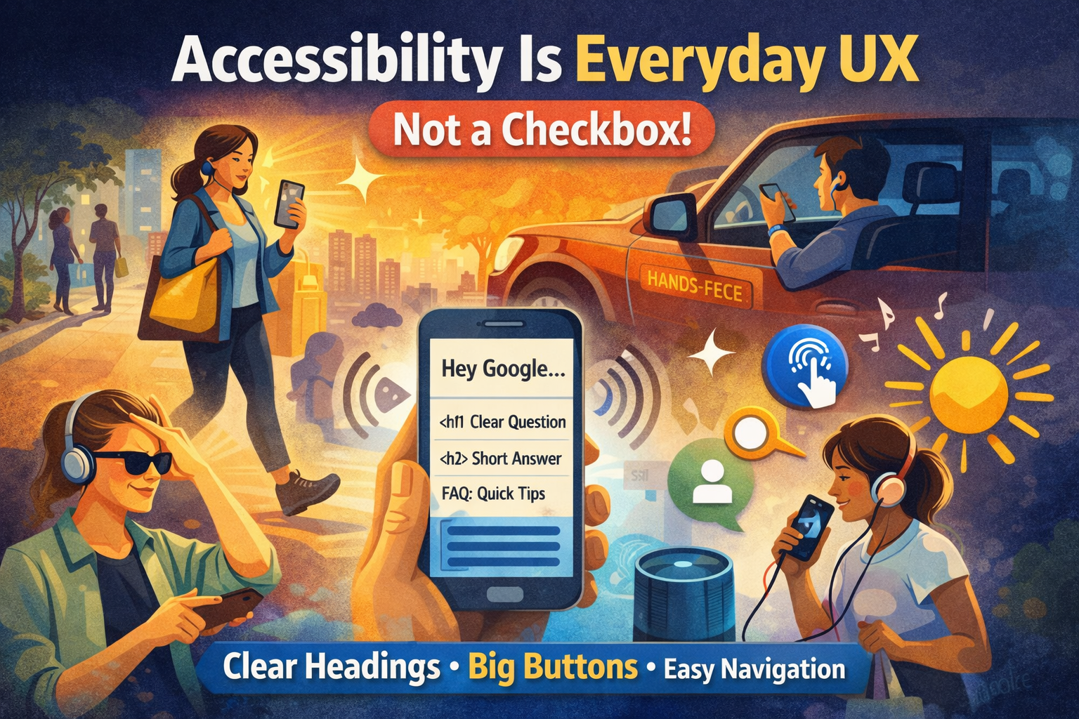
Key takeaways
- Accessibility is everyday UX: walking, glare, stress, one-handed use, and hands-free moments.
- Voice assistants rely on structure: headings, semantic HTML, and clear answers.
- Accessible patterns reduce friction and improve conversions (forms, taps, readability).
- Good structure helps both screen readers and SEO (less ambiguity, better parsing).
- A structured site is easier to use, easier to rank, and easier to convert.
Introduction
Accessibility isn’t just for a small group of users it’s for real life. The moment you’re walking, carrying groceries, using one hand, fighting glare on a phone, or relying on voice assistants like Siri or Hey Google, you’re experiencing an accessibility scenario.
And here’s the part most websites miss: accessibility is tightly tied to structure. A site that is cleanly structured (semantic HTML, clear headings, meaningful links, consistent navigation) is easier for humans, screen readers, and search engines.
1) Real life creates “temporary disabilities”
You don’t need a diagnosis to benefit from accessibility.
- Walking → you scan faster and click less precisely.
- Driving (hands-free) → you rely on voice, short answers, and clear actions.
- Bright sunlight → low contrast becomes unreadable.
- Noise → audio cues fail; captions matter.
- Stress + time pressure → cognitive load rises; clarity wins.
Designing for these contexts makes your site more usable for everyone, especially on mobile.
2) Voice assistants depend on structure
When users ask Siri or Google a question, the assistant needs content it can parse confidently. That typically means:
- Clear heading hierarchy (H1 → H2 → H3)
- Short, direct answers near the top
- Descriptive links (not “click here”)
- Clean navigation labels (predictable categories)
Accessibility patterns overlap with SEO patterns because both are about reducing ambiguity.
3) A well-structured site converts better
Accessibility improves conversion because it reduces friction:
- Buttons that are large enough to tap
- Forms with clear labels and error messages
- Readable typography and spacing
- Logical page flow (what, who, proof, CTA)
Less friction = more leads.
4) The “structure stack” that fixes both UX and SEO
- Semantic HTML: header/nav/main/footer, real buttons, real labels
- Heading hierarchy: one H1, clean sections, scannable layout
- Internal links: connect blog → services → contact
- Performance: faster sites are easier to use and rank
If you get the structure right, accessibility becomes natural instead of painful.
FAQ
Is accessibility only for people with disabilities?
No. Accessibility also supports everyday situations like walking, glare, fatigue, low attention, or using voice assistants. It’s usability under real constraints.
How does accessibility connect to SEO?
Both rely on clarity and structure. Semantic HTML, headings, descriptive links, and clean navigation help search engines interpret pages and help users navigate them.
What’s the fastest accessibility win for most sites?
Fix headings and semantic structure first, then address contrast, tap targets, form labels, and keyboard focus. Structure creates the foundation.
Does accessibility improve conversions?
Yes. Clear CTAs, readable pages, and low-friction forms reduce drop-off especially on mobile where most leads are won or lost.
Do I need a full rebuild to improve accessibility?
Usually not. Many improvements are incremental: structure, labels, contrast, focus states, and better content layout.